Monday, January 23, 2017

The Importance of Posters

Character and Function

  Nowadays people think that posters are an inefficient way to communicate a message because they are living in the age of social media where everything is faster. However, posters still serve a major purpose in our everyday lives. Posters illustrate the changing form of the arts while advertising a message at the same time. Using a poster to advertise is another form of expression for artists and designers. It helps the viewer establish a relationship with the message through color, shapes, lines, type, and images. On top of it all, posters fulfill many purposes and influence our decisions every day.

The Laws of Poster Designing

   A poster should, in most cases, catch the eye of the viewer or reader, In order for this to happen, multiple elements must be incorporated into the poster, the obvious ones being color, shape, text, and so on. But other effects like contrast, proportion, rhythm, and dynamics can have an even bigger effect on the final product.

General Demands of Poster Designing
   For a poster to be successful, it obviously needs to be easy to read and understand. The poster must have a great effect on the viewer from far away, meaning that it needs to catch the eye almost instantly for the reader to even glance. Finally, the poster needs to be easy to recognize so that the reader will have a memory of the poster and recall the information or graphics on it.

Lettering in Poster Design
   How effective is a poster if it's not legible? Again. the lettering on a poster needs to be easy to read from a distance. However, the font or size of the text needs to be proportional to the other elements, information, and graphics on the poster. The font needs to be modern but still pop and catch the reader's eye. The lettering also needs to flow with and fit the theme of the rest of the poster, so the right lettering is a crucial part to the poster as a whole.

Shapes in Poster Design
   Using shapes in posters help give it a dynamic and strong or harmonious and soft effect, all depending on how the shapes are arranged. For example, horizontal, vertical, and diagonal lines and shapes help create a dynamic effect and can also lead the eye across the poster if done correctly. Overlapping shapes with text or images can help unify the poster as a whole. Although overlapping lines and shapes can help bring the poster together and put on the finishing touches, they still need to be pleasant and easy on the eyes so it is not too confusing (unless it's an optical illusion).

Color in Poster Design
   Color is one of the most effective elements of a poster. It can clarify information, give the poster a feeling of rhythm, communicate a message, connect other elements, and emphazie the purpose of the poster (social, economical, political, etc.). Color can obviously be used to color the objects in the poster, but it has a powerful effect on the poster when it isn't the main focus.

My Takeaways

   Before taking on this project, I only understood that a poster was used to communicate an idea or concept in a graphic measure. However, a poster can inspire other ideas than the ones conveyed on it. One of the most important things that I learned is that everything in a poster should compliment and be proportional to the other elements. This is important so that one thing does not take too much emphasis away from the other information or graphics. I also found that a poster should have lots of movement and be active because it is placed on a stationary surface. In this manner, it will be easier for a poster to catch a reader's attention if it has movemnt rather than being simple. Of course, it is very important for the poster to be legible to that the reader can view it from a distance and understand the main points easily and quickly.

   One of the most valuable things I learned is that effects like dynamics, proportion, and rhythm can be extremely important when designing a poster. I can remember this skill for the future so that I can place more emphasis on these effects instead of focusing only on the color or the text. Overall, I learned lots of useful skills that will help me look at graphics in a more knowledgeable way. These skills will also help me understand what the designer or artist was attempting to convey with their work and it will help me develop an appreciation for it.
Friday, December 16, 2016

Semester Reflection- Graphic Design

Projects 

Photoshop Tutorials 

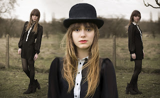
The first project of the semester was a series of tutorials to reintroduce Photoshop. This project took a little over a month to complete. Some of the tools in Photoshop took a while to understand how to use and it was a bit difficult to keep up with the pacing of the tutorials. The collage of the girl below took longer than the other tutorials and it took lots of tools and layers to create. I learned how to use most of the tools in Photoshop and I will be able to use them to enhance my projects. The tutorials made me more comfortable with Photoshop. 

    As for feedback, I was told to stay persistent with the tutorials and to make sure that everything was blended and smooth, so that people wouldn't know that the image had been photoshopped. I went back and tried to blend everything to make the picture look realistic. Each tutorial focused on a different aspect and/or tool in Photoshop, so some projects were more difficult than others. However, I enjoyed the projects because it made me feel more comfortable working in Photoshop and it gave me a better understanding of the program. 

Fall Raccoon 

   I went back to Illustrator for the Fall Raccoon project. The goal was to create a vectored raccoon, place it in a fall background, and to create a postcard and incorporate the raccoon into any theme that you chose. This project took about 3 weeks to complete and the postcards that we printed came about 2 weeks later. I think the most difficult part of the project was the individual theme that I chose because it was the first time that I made something that I didn't follow a tutorial for, so making some of the objects was confusing and took some time to make. I learned what a bleed was and its importance in graphic design. I also learned how to use the pathfinder window, which I now use in a lot of my projects. I ended up changing the fall background because it originally looked cluttered and messy. I really enjoyed this project because I was able to branch out and make something that I knew how to create and that I was proud of. 

Vectored Self Portrait

   The vectored self portrait was a project that required precision and focus. The project took about 2 weeks and I had to stay after to finish it a couple of times. One of the things that I struggled with was the precision of each tone on my face, shirt, or hair. The main tool that was used was the pen tool in Illustrator, which I now use a lot in my projects. I also had trouble finding the appropriate skin tone, even though I was using the eyedropper tool. I enhanced my project by making the background contrast with my skin tone so that it would pop. However, I don't really like how the portrait turned out because the skin tone on the vectored version does not match my skin tone in the original photo. This was probably one of my least favorite projects because it required patience, which wore thin for me during this project. Now that I know how to use the pen tool correctly, I think that I would be able to make a more accurate portrait than my first one. 

Infographic 

   My most recent project is my New Years' Eve infographic. This project took about 3 weeks to fully complete. Some of the challenges that I faced were accurately displaying information in a graphic. There was surprisingly a lot of math involved in making my graphics. The layout also took a while for me to finalize because I had to decide which layout would show hierarchy and also be easy to read for the viewer. I learned the importance of guidelines and rulers and how they section off portions of the project. I also learned how to condense information and use a graphic to display it. Some of the upperclassmen in the program critiqued my project and they told me to have a set color theme and have each section as a background instead of the same color as a background for the entire poster. Mrs. Burdolski also wanted me to leave some 'breathing room' in each of my sections so that the poster felt more spacious. I changed the size of my text and made some of the graphics smaller to add room in each of the sections. This project was my favorite because I used all of my illustrator skills for this project, like the pen tool to trace the NYE ball and adjusting transparency with the champagne bottle. I spent a lot of time on this project and it succeeded the expectations that I had for it. 

Constructivism 

   Currently, I am working on a 5-slide presentation about Constructivism. I wrote a paper about the movement and I am working on the presentation slides. Each slide uses principles like radial patterns, slanted text, and a color theme that consists of red, black, tan, and yellow. The movement is mainly propaganda during the Russian Revolution. Since I am still working on the project, I don't have a picture to show.

Time Management

   During class, I feel like I mostly use my time well. I am a bit of a slow worker, so I have had to come in a couple of times after school to finish up projects and make them my best. I think that the only time I've finished work early is my artboard for Behance, which doesn't take too long. If I have time to spare, I check my project again and write a blog post about it. I also go on Behance and look for inspiration for future projects. I also look at the upperclassmen's work to see how they have progressed. During class, I ask people to review and critique my work and I give them suggestions on their work. However, I get pulled into conversation easily, but I get back to focusing on my work and getting it finished. Outside of class, I sometimes go on Behance or Pinterest and look at posts on photography, Photoshop, or Illustrator skills. 

Strengths and Weaknesses

   I feel that I am very well at writing reviews and critiques on my graphic design projects. I also think that I use my time well in class. I think that my work represents my personality with the colors, fonts, and graphics I use and make. I enhance my strengths by trying to incorporate them into my projects and working hard in class. For weaknesses, it takes me while to figure out the best way to make something. Once I figure out how to start the project, the rest of the designing becomes easier. I also need to work at a faster pace so I can get projects done quicker but still have them look neat and professional. I have shortcut keys and different strategies to make items written down in my sketchbook, so it should make the process go by quicker in the future. 

Sharing my Projects

   From the beginning of the year, I have been using my Behance account to share my work and look at students' and professionals' work. It is an easy way to access my peers work and be able to give feedback for them. I like designing artboards for Behance because you can give a thorough explanation and process of the project without using paragraphs of text and it creates a relaxed environment. I like being able to view professional's work so I can get inspiration from their projects to use in my own. I also use this blog as a way to share all of my e-Comm work, not just my graphic design projects. I like being able to see how my skills progress with each project. 

Summary

   I really enjoyed this semester in graphic design, especially when working on my infographic because I was able to collaborate with the people around me and base ideas off of them. Next semester, I really want to focus on my work in class so that I no longer have to stay after school for long periods of time to finish it. I will also put more creativity into my projects so that they reflect my style and personality. I learned how to use lots of different programs, websites, and tools this semester and they all contribute to my portfolio. I like being able to use new skills for future projects and seeing the advancement with each skill. I am excited for next semester's projects in graphic design and I want to learn more about the graphic design industry. 

Friday, December 2, 2016

New Years' Eve Infographic


         My infographic is about the New Years' Eve celebration in Times Square. I really like the graphics that I made and I spent a lot of time making them. I was able to use less type  because my graphics conveyed enough information. This project made me use a lot of illustrator skills and I gained new skills, like downloading fonts and changing typography. Overall, I really enjoyed this project and I love the final result.

Tuesday, November 29, 2016

"Leadership is Influence, Nothing More, Nothing Less"

   This project was the second featured story that we made. There were improvements made from my last featured story. The goal of the project was to create a featured story with changes from the last one and focus more on getting more b-roll and a wider variety of shots.
   Before the project, I wrote my questions for the 2 interviews, did research on the topic, and planned the schedule for the project. I filmed the two interviews and got B-Roll for my project in the same day and started editing the video on the next Monday. Editing took a while because I had to make subclips of my B-Roll and adjust the levels on each subclip.
   Along the way, I learned a lot about writing a good featured story, like having a smaller story in the entire featured story.  I also learned how to make lower-thirds in Premier Pro, which are the name titles at the bottom of the screen. I learned how to work with deadlines by having my footage before the due date so I had more time to edit it. For differences, I wish I would have been more confident in my story so I knew specifically what B-Roll to get. The B-Roll in my story doesn't really correlate with the scope of the story. I really liked the lighting of my footage; it was white-balanced and well exposed. My voiceover and interviews were clear and loud, so it was easy to hear. For my next project, I will make sure to collect enough footage so that I have plenty to work with. I will also make sure to have my B-Roll relate to the story better (I had to change the focus of my story mid-project, so that is why my B-Roll doesn't relate well). Overall, I liked my first featured story better because the story was better told and the project was a lot more fun to film. However, this assignment gave me more ideas to improve on, which will help me in my next project.

Tuesday, November 1, 2016

Featured Story

   The concept for my featured story was to tell the story of a coach named Travis Martinez, who coached the OYB Tigers, and the legacy he left on the team after he passed away to AML. He affected the lives of many people, including everyone on the Tigers.

   I introduced the story with the line "most people think that the baseball season is over by the month of October, but for the Olathe Youth Baseball Tigers, October is a special month." it impacted my story by intriguing the viewer to keep watching the video to see why October means a lot to the team. The two people I interviewed, Tara Martinez (Travis's wife) and Doug Beckwith (the head coach) complimented each other in the story because it gave two different perspectives on the "meat" of the story: the legacy that Travis left and how it impacted the team. Tara talked about his cancer and why he decided to coach baseball and Doug talked about the legacy and what the team did to honor him. 

   The questions were a bit challenging to write because I didn't want Tara to feel to feel too emotional while answering the questions or get too in detail. I filmed the video over a weekend with my own camera because I filmed the video a while before the b-roll was due. I didn't have an external mic but there the wind wasn't too strong that it affected the audio. The 4 members of the baseball team who decided to be in the video were very cooperative, and I'm very thankful for that. The voiceover was also challenging to plan because I had multiple answers to the same question and lots of sound bytes to choose from. 

   For my finished video, I really liked the quote from Doug at the end where he talks about what the team learned from Travis. I feel that the quote is a very nice end to the video. However, I feel that I need to improve on my composition of shots because I have a lot of different wide and extreme-wide shots but not a lot of close-ups. I had to repeat some b-roll, which made the video seem very repetitive. Overall, I really like my video and even though I have things to improve on, the product of my video turned out really well. 


Monday, October 3, 2016

1 in 2000

   There are so many students at Olathe Northwest with interesting talents and hobbies. For the 1 in 2000 project, I interviewed Addison Smith about her passion for the Kansas City Royals.

   For the 1 in 2000 project, I had to write my 21 questions for my interviewee, film the responses to the questions, write my script with the soundbites, record my voice over, and edit and export my video. The whole process took about two weeks because the class learned how to control and manage audio appropriately since we were exporting the projects as MP3 files. I took away many things from this project because the class is still learning how to use the equipment and edit in Premier Pro. One major thing I learned was how to control audio channels and set audio gain with my clips, voice over, and sound effects. I made sure that the audio remained fairly even throughout the project and adjusted the volume of the sound effects so that the volume was appropriate. I had to finish my script and storyboarding at home in order to meet the deadline for the project.

   This project dealt with a lot of new tools in Premier Pro, so getting used to the new features made my project a little hard to manage in the beginning. For differences, I would have liked to find more diverse sound effects to include with the bat and cheering sound effects. It would have been better to record the responses to the questions in a different and quieter environment because the natural noise is hard to turn down. I feel like my audio was fairly even throughout the project. In my revisions, I discovered how to blend sound effects, so they sounded much better. For the next project, I will remember how to make my audio even so my projects sound the best. Overall, this project helped me understand the importance of audio and the major role it plays in projects.
                                                               
                                                              1 in 2000 Audio

Sunday, September 11, 2016

Photoshop Tutorials Reflection


Photo collage- Tutorial 6
Covering blemishes on the wall- Tutorial 1
   In these Photoshop Tutorial videos, I relearned how to use certain tools and I was exposed to new tools and features that are extremely helpful. I learned how to make a collage of pictures and make them blend together, I was introduced to layer masks and how to use them, some  basic retouching like taking out blemishes, and more useful skills.


   The three most important tools I used, in my opinion, were the layer mask feature, the clone stamp tool, and the quick selection tool. The layer mask tool was used in multiple projects, like the photo collage and the challenge project especially. It is an essential tool because you can make a broad selection and use the mask tool to take out portions of the selection or bring them back. It's also non-destructive, so you can make as many mistakes and not affect the other layers. The clone tool is one of my favorite tools because it is really easy to use. This tool is important for removing blemishes, covering up unwanted items, and blending. The quick selection tool helps make selections to move or helps determine the area for the layer mask.


Removing the logo on the surfboard-Tutorial 1
   My favorite skill that I learned from these tutorials was the layer mask tool. It helped with the sleeves in the collage of the girl. It was super simple to remove or add portions of the photo. The tool will help in the future when I need to take small portions of a photo out or add it back in when I make mistakes.


Removing objects in the photo- Tutorial 1 


Adding a logo to a bottle- Branding Tutorial 1
    During this project, I feel like I knew how to use the basic tools in the tool bar really well. I also remembered a lot of the shortcut keys and they were helpful when I was watching the tutorials. However, I was really confused on using layer masks and how to get them started. Also, I started working on the wrong layers because there were so many that I had to keep organized in some of the projects. 


Removing blemishes- Tutorial 5
Adding a graphic to a billboard- Branding Tutorial 2
   For these tutorials, I would have taken more notes so I can remember what each of the tools and shortcuts do for future projects. I really like how I used the layer masks because the projects look cleaner and sharper when I used it. Overall, these tutorials helped me remember the uses for Photoshop and how each of the tools is used. The projects were difficult but the products turned out nicely. 


Removing a logo- Tutorial 2
Moving a logo- Tutorial 1
Removing an object from a photo- Tutorial 4

Removing a tag- Tutorial 3